
Responsive web design is an approach to designing and developing websites that ensure optimal viewing and interaction across various devices and screen sizes. It involves creating flexible layouts, fluid images, and adaptable media queries to automatically adjust the website’s appearance and functionality based on the device being used. The goal is to provide users with a consistent and user-friendly experience, regardless of whether they are accessing the website on a desktop computer, laptop, tablet, or smartphone.
The concept of responsive web design originated from the need to address the challenges posed by the rapidly evolving landscape of digital devices. In the early days of the Internet, websites were primarily designed for desktop computers with standard screen sizes and resolutions. However, with the advent of smartphones and tablets, there was a growing demand for websites that could adapt to these smaller screens.
Before responsive design, developers used various techniques to accommodate different devices, such as creating separate websites or mobile-specific versions of their sites. However, this approach proved cumbersome, time-consuming, and challenging to maintain. As the number of devices and screen sizes increased, a more efficient and scalable solution was needed.
With the rise of smartphones and the widespread adoption of mobile browsing, responsive design quickly gained popularity and became an industry standard. Web designers and developers recognized the benefits of creating websites that could adapt to any device, eliminating the need for separate versions and ensuring a consistent user experience. Over the years, responsive web design has evolved and matured, with technological advancements and new best practices emerging. The introduction of frameworks and libraries like Bootstrap and Foundation made it easier for developers to implement responsive design principles.
Today, responsive design is considered a fundamental requirement for modern web development. It has become an essential practice for businesses and organizations looking to reach their audiences effectively and provide a seamless user experience across devices. With the ever-increasing diversity of devices and screen sizes, responsive web design continues to evolve, adapt, and shape how we build and experience websites. Let us dive into why responsive design is crucial for your website.
Why do you need a Responsive Design for your website?

Mobile-Friendly Design
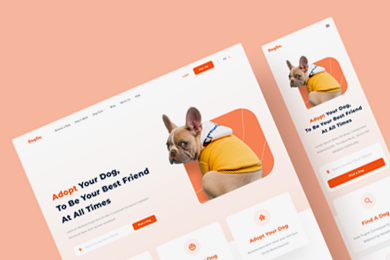
One of the primary objectives of responsive design is to create a mobile-friendly website. With the proliferation of smartphones and tablets, users increasingly rely on these devices to browse the internet. Monarch Web World recognizes the significance of catering to mobile users’ unique needs and browsing habits. Their team of experts specializes in designing mobile-responsive websites that optimize the user experience on smaller screens. By implementing responsive web design services, businesses can capture the attention of their mobile audience and deliver an engaging experience that keeps them coming back for more.
Responsive Website Templates:
Monarch Web World offers responsive website templates that combine visually appealing designs with high functionality. These templates are designed to be responsive right out of the box, eliminating the need for businesses to spend excessive time and resources on custom development.
- Visual consistency across devices: Monarch Web World's responsive website templates ensure your brand identity remains consistent across different devices. They customise the templates to incorporate your logo, colours, and unique features, allowing you to maintain a professional and customer-centric online presence.
- Streamlined maintenance and updates: With responsive website templates, you can streamline the website maintenance and updates process. Any changes made to the template automatically apply to all device-specific layouts, saving you time and effort.
- Enhanced user experience: Responsive website templates should be carefully crafted to provide an exceptional user experience on all devices. They focus on intuitive navigation, easy-to-read content, and visually appealing design to engage users and keep them engaged with your website.
Responsive Website Templates:
Responsive design aims to provide users with a seamless and enjoyable browsing experience, regardless of their device. Monarch Web World goes beyond adapting to different screen sizes and optimises other elements to enhance the overall user experience.
- Responsive images: Understand the importance of responsive photos that load quickly and appear crisp on any device. They implement techniques like image optimization and lazy loading to ensure your visuals retain quality while adjusting to different screen resolutions. This provides a visually engaging experience for your customers.
- Responsive typography: Legibility is crucial across all devices. Ensure your text is legible and visually appealing, regardless of the device used. They consider factors such as font size, line spacing, and line length to create a consistent and readable typographic experience.
- Intuitive user interfaces: Monarch Web World's experts focus on creating intuitive user interfaces that are easy to understand and interact with. They consider clear calls-to-action, logical page flows, and well-organised content to enhance usability and provide a seamless browsing experience.
CSS Media Queries and Beyond:
Monarch Web World’s team of experts leverages CSS media queries, a core component of responsive design, to create responsive layouts. These queries allow the website to detect the user’s device and adjust the plan accordingly. They can apply CSS rules specific to certain screen sizes, ensuring the website looks and functions optimally on every device.
Search Engine Optimization (SEO) Benefits:
Responsive design offers SEO benefits that positively impact search engine rankings:
- Mobile-First Indexing: Responsive design optimises websites for mobile devices, increasing their chances of ranking higher in search results.
- Improved User Experience: Consistent and user-friendly experiences across devices lead to higher rankings. Responsive design reduces bounce rates and increases engagement signals.
- Faster Page Loading Speed: Optimised code and content delivery result in shorter loading times on desktop and mobile devices, improving user experience and search engine rankings.
- Reduced Duplicate Content: Responsive design eliminates duplicate content issues by adapting to different devices using the same HTML structure.
- Lower Bounce Rates: Responsive design provides a seamless and engaging experience, reducing bounce rates and signalling quality to search engines.
Cost Saving Benefits:
Responsive design also offers cost-saving benefits:
- Single Website Development: Develop and maintain a single responsive website instead of separate platforms, saving costs associated with design and maintenance.
- Content Management Efficiency: Updates and changes reflected across all devices, eliminating content duplication and saving time and resources.
- Streamlined Maintenance: Maintaining one platform reduces the effort for updates, security patches, and bug fixes.
- Lower Hosting and Infrastructure Costs: A single responsive website reduces the need for separate servers or hosting plans, resulting in cost savings.
- Future-Proofing: Responsive design adapts to new devices and screen sizes, saving costs on frequent redesigns and redevelopments.
Optimised Conversion Rates
Responsive design optimises conversion rates:
- Consistent Brand Experience: Responsive design ensures a consistent brand identity across all devices, fostering trust and encouraging conversions.
- Easy Navigation and User Interface: Intuitive navigation and user-friendly interfaces reduce friction and increase conversion likelihood.
- Mobile Checkout Optimization: Streamlined and mobile-optimised checkout processes reduce cart abandonment rates.
- Call-to-Action (CTA) Optimization: Responsive design optimises CTAs for different screen sizes, maximising conversion opportunities.
- Personalization and Targeting: Tailoring messaging and offers to specific devices enhances engagement and conversions.
Cross-Device Analytics And Data Tracking:
Responsive design enables cross-device analytics and data tracking:
- Unified Data Insights: Track user behaviour and conversion data across all devices from a single analytics dashboard.
- Comprehensive Conversion Funnels: Analyse user journeys and identify trends across devices.
- Device-Specific Performance Analysis: Evaluate website performance on different devices and make targeted improvements.
- User Preference Insights: Gain insights into user preferences and behaviours across platforms to tailor marketing strategies.
- Enhanced Personalization: Use device-specific data to deliver personalised content and recommendations, improving engagement and conversions.
Building Blocks of Responsive Design

The Role of Fluid Grid Layouts in Responsive Design:
Fluid grid layouts are like the backbone of responsive design. They’re the secret sauce that makes websites adapt beautifully to different devices. Instead of fixed pixel values, fluid grid layouts use proportional sizing, allowing elements to resize and reposition based on screen size. This means your website will look great on a desktop, tablet, or smartphone, providing a consistent user experience across all devices. To simplify it, remarkable CSS frameworks like Bootstrap and Foundation offer pre-defined grid systems you can customise to fit your design perfectly.
Making Images and Media Elements Flexible:
Images and media elements are the eye-catching stars of your website, but they need to be flexible to shine on every screen. Using CSS properties like “max-width: 100%” and “height: auto,” you can ensure that images and media adjust proportionally and don’t overflow their containers. That way, your visuals will scale gracefully on any device. You can also take advantage of responsive image techniques, like the “srcset” attribute or the “picture” element, which allow the browser to choose the best image version based on the user’s device capabilities and screen size. And remember lazy loading, which loads images and media only when needed, speeding up your website’s initial loading time.
Using CSS Media Queries to Enhance Responsiveness
CSS media queries are like magical spells that enhance the responsiveness of your design. With media queries, you can apply specific CSS rules based on device characteristics, such as screen width, resolution, orientation, or touch support. It’s like giving your website superpowers to adapt and look its best in every situation. By defining breakpoints in your CSS, you can create design changes at specific screen sizes, optimising the user experience for different devices. Whether tweaking font sizes, rearranging content, or hiding elements on smaller screens, media queries give you the control to make your design shine across the digital landscape. And suppose you use CSS preprocessors like Sass or Less. In that case, media queries become even more flexible, allowing you to easily use variables and mixins to maintain and modify your responsive styles.
Mapping Out Your Responsive Design Strategy

Weighing the Pros and Cons: Mobile-First vs. Desktop-First
When planning your responsive design strategy, you have two approaches to consider: mobile-first and desktop-first. The mobile-first design puts mobile devices at the forefront, prioritising their needs and constraints. It ensures a streamlined experience on smartphones and tablets, optimising performance and focusing on the most critical content. On the other hand, desktop-first design takes a more traditional approach, starting with desktop screens and then adapting to smaller devices. This allows for intricate, detailed layouts that are visually appealing and feature-rich. However, adjusting the design for mobile devices might require extra effort. So, it’s a balancing act between catering to the growing mobile audience and leveraging the strengths of desktop experiences. Both approaches have pros and cons; the right choice depends on your project’s goals and target audience.
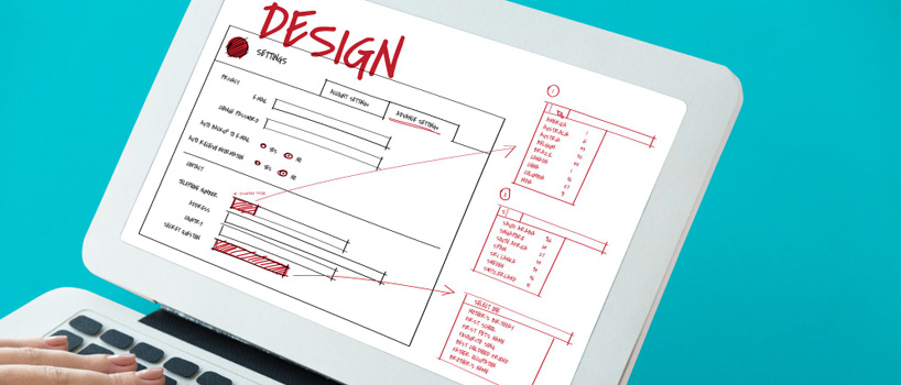
The Importance of Wireframes and Prototypes in Planning
Wireframes and prototypes are like the architects’ blueprint and a sneak peek of your responsive design. Wireframes are visual representations that outline the structure and layout of your webpage or app. They help you visualise how your design will adapt across different devices, ensuring the content fits perfectly and maintains usability. It’s like laying the foundation for a solid responsive experience. Prototypes, on the other hand, bring your design to life in an interactive way. They allow users to experience the layout, interactions, and responsiveness firsthand. Gathering feedback and testing usability, prototypes help you iterate and refine your design before diving into development. They provide a realistic, responsive design preview, allowing stakeholders to understand and validate the user experience. So, wireframes and prototypes are like your best friends in planning, ensuring you create a user-centric and optimised design.
Why Accessibility Should Be a Top Priority in Your Design
When designing websites or applications, accessibility should be at the top of your priority list. Accessibility ensures that everyone, regardless of their abilities or devices, can access and use digital content effectively. It’s about inclusivity and providing a positive user experience for all. By making your design accessible, you’re opening doors for individuals with disabilities to engage with your content. This means considering things like providing alternative text for images and media elements to assist users with visual impairments, ensuring proper colour contrast for legibility, implementing keyboard navigation and focus management for those who can’t use a mouse, and designing with clear and organised content structures to assist users with cognitive disabilities. Adhering to accessibility guidelines and standards, such as the Web Content Accessibility Guidelines (WCAG), ensures compliance and provides best practices for inclusive design. So, by making accessibility a priority, you’re not only doing the right thing but also creating a better experience for everyone who interacts with your design.
Getting Your Hands Dirty: Implementing Responsive Design
Using Frameworks like Bootstrap to Simplify Your Task
Frameworks like Bootstrap are the superheroes of responsive design. They come with pre-built responsive grid systems, components, and styles that can be easily customised and integrated into your project. With Bootstrap, you can save time and effort by leveraging its responsive grid system, which offers a mobile-first approach. This means you can create flexible and responsive layouts without starting from scratch. The framework also provides various responsive components, like navigation menus, modals, carousels, and forms, designed to adapt seamlessly to different screen sizes. And the best part? Bootstrap takes care of cross-browser compatibility and responsive behaviour out of the box, reducing the need for extensive custom CSS coding. With extensive documentation and a large community, Bootstrap makes implementing responsive design a breeze, allowing you to focus on creating an incredible user experience.
Coding Custom CSS for Greater Control
While frameworks like Bootstrap are fantastic, sometimes you crave more control and the ability to create a unique design. That’s where custom CSS comes into play. By coding your own CSS, you can have granular control over every aspect of your responsive design. Custom media queries become your secret weapon, allowing you to define breakpoints and apply specific responsive styles for different screen sizes. You can optimise font sizes, tweak spacing, adjust layouts, or even hide elements that aren’t relevant on smaller screens. You can implement advanced layout techniques like Flexbox or CSS Grid with custom CSS, unleashing your creativity to achieve intricate and adaptive designs. Sure, it might require more time and expertise, but the result is a tailor-made design that aligns perfectly with your project’s requirements and branding. So, don’t be afraid to get your hands dirty and code your custom CSS—it’s like sculpting your responsive masterpiece.
In the digital era, where customers expect seamless experiences on every device, responsive design has become a non-negotiable aspect of website development. Monarch Web World, a trusted digital marketing firm, offers tailored solutions for businesses seeking to delight customers on every device. Through responsive web design services, mobile-friendly design, and the utilisation of responsive website templates, they ensure a consistent and user-friendly browsing experience. By incorporating techniques like responsive images, typography, CSS media queries, and performance optimization, they create websites that captivate audiences and drive business growth. Embrace responsive design and let Monarch Web World help you create a digital presence that delights your customers at every touchpoint.