Mobiles have become a need rather than a want for people. Lives would only stop if today’s people owned at least one smartphone per house. This is not an exaggeration but the literal truth. In such a situation, ensuring your website is optimized for mobile conversions is crucial for business success. A responsive website redesign is vital to unlocking your online presence’s potential and maximizing mobile conversions.
In today’s digital landscape, the importance of mobile conversions cannot be overstated. With the rapid proliferation of smartphones and tablets, many people are accessing the internet through their mobile devices. As a result, businesses must recognize the significance of optimising their websites for mobile users and understand the impact it has on conversions.
- 1. The Rise of Mobile Usage:
- According to a report by Statista, as of 2021, over 54% of global website traffic came from mobile devices.
- In the United States alone, mobile devices accounted for approximately 55% of internet usage, surpassing desktop computers.
- Mobile usage continues to grow yearly, emphasizing the need to cater to this audience. Increasing the demand for you to serve such users.
- 2. Mobile Conversions vs. Desktop Conversions:
- While desktop conversions still hold importance, the shift towards mobile devices must be addressed.
- Studies have shown that mobile conversions have been steadily increasing, with more users comfortable making purchases or taking action directly from their mobile devices.
- In fact, a study by Google found that 70% of smartphone users who purchased in a store had first turned to their mobile devices for relevant information.
- Mobile conversions contribute to direct sales and play a significant role in influencing offline purchases.
Setting Expectations: What This Guide Offers
This comprehensive guide highlights the crucial relationship between responsive website design and mobile conversions. By adopting responsive design principles and implementing a website redesign, businesses can optimize their mobile user experience and drive growth.
Understanding the influence of a responsive website redesign on mobile conversions is essential for businesses aiming to achieve their online objectives. This guide provides a wealth of information, including statistics, case studies, and actionable best practices, enabling you to enhance your mobile conversions and drive substantial growth.
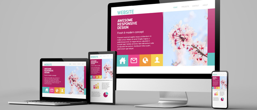
Responsive Design and Mobile Conversions: The Connection
Responsive design is an innovative approach to web development that focuses on creating websites that adapt fluidly to various devices and screen sizes. It ensures that your website provides an optimal user experience regardless of whether accessed from a desktop computer, a tablet, or a smartphone. Here are some key aspects of responsive design:
- 1. Fluid Grids: Responsive design employs fluid grid systems that allow website elements to resize proportionally based on the user's screen size. This flexibility ensures content is displayed appropriately and maintains readability across different devices.
- 2. Flexible Images and Media: Responsive design incorporates techniques that enable images, videos, and other media elements to scale and adjust based on the available screen space. This ensures that visual content remains appealing and doesn't hinder the overall user experience.
- 3. Media Queries: Responsive websites use CSS media queries to detect the characteristics of the user's device and apply specific styles accordingly. Media queries enable the website to adapt and optimize its layout and functionality by targeting different screen resolutions, orientations, and device capabilities.
- 4. Mobile-First Approach: With the prevalence of mobile device usage, responsive design often follows a mobile-first approach. This means designing the website primarily for mobile devices and gradually enhancing it for larger screens. By prioritizing the mobile experience, businesses can ensure their websites are accessible and functional for most users.
The Role of Responsive Design in Mobile Conversions
The responsive design significantly impacts mobile conversions by improving user experience and facilitating desired actions. Here’s how responsive design influences mobile conversions:
- 1. Enhanced User Experience: A responsive website provides users a consistent and optimized experience across devices. Users can easily navigate, read, and interact with the site by automatically adjusting the layout and content to fit different screen sizes. A positive user experience increases engagement and a higher likelihood of conversions.
- 2. Reduced Bounce Rates: Bounce rate refers to the percentage of visitors who leave a website after viewing only one page. A lack of responsiveness can frustrate mobile users, leading to higher bounce rates. Responsive design ensures users can access all relevant information and functionality without excessive scrolling or zooming. This seamless experience reduces bounce rates and encourages users to explore further, increasing the chances of conversion.
- 3. Improved Page Load Speed: Mobile users expect fast-loading websites. Responsive design allows for optimized loading times by delivering the necessary resources based on the user's device capabilities. By reducing loading times, responsive websites provide a smoother and more efficient experience, increasing user satisfaction and the likelihood of conversions.
- 4. Effective Call-to-Action Placement: Responsive design enables strategic placement of call-to-action (CTA) elements on mobile devices. CTAs, such as "Buy Now" or "Sign Up," can be positioned prominently and tailored to the screen size and layout. This ensures that users can easily spot and engage with CTAs, boosting conversion rates.
- 5. Mobile SEO Benefits: Responsive design aligns with Google's recommended approach for mobile-friendly websites. Search engines prioritize responsive sites in mobile search results, improving visibility and organic traffic. A higher search ranking leads to increased mobile visits, enhancing the potential for conversions.
By adopting responsive design principles and executing a website redesign, businesses can create mobile-friendly experiences that positively impact mobile conversions. With improved user experience, reduced bounce rates, optimized loading times, effective CTAs, and enhanced visibility in search results, responsive design paves the way for increased mobile conversions and overall business growth.
The State of Mobile Internet Usage: Facts and Figures
Global Mobile Internet Usage Trends
Mobile internet usage has experienced a tremendous surge worldwide, reflecting changing consumer habits and the increasing ubiquity of smartphones. Here are some notable trends in global mobile internet usage:
- 1. Mobile Internet Penetration:
- As of 2021, mobile devices accounted for over 54% of global website traffic (Statista).
- In certain regions, mobile internet penetration is even more significant. For example, in Asia-Pacific, mobile devices generated approximately 64% of web page views (StatCounter).
- 2. Mobile Apps vs. Mobile Browsers:
- Mobile apps play a substantial role in mobile internet usage. According to App Annie, consumers worldwide spent over 3.5 trillion hours on mobile apps in 2021, a 7% increase compared to the previous year.
- Mobile browsers remain crucial, especially for search engine usage, information access, and website browsing.
- 3. Social Media and Mobile:
- Social media platforms have become predominantly mobile-centric. According to Hootsuite, as of January 2021, around 98.9% of Facebook's active user base accessed the platform via mobile devices.
- Instagram, Twitter, and Snapchat also report most users access their services through mobile devices.
The Impact of Mobile Usage on Online Business Success
The dominance of mobile usage has had a profound impact on the success of online businesses. Ignoring the needs and preferences of mobile users can lead to significant repercussions, including:
- 1. Missed Opportunities:
- With most internet users accessing websites via mobile devices, businesses that do not prioritize mobile-friendly experiences risk losing potential customers and valuable opportunities for engagement.
- According to Google, 61% of users are unlikely to return to a website they needed help accessing from their mobile devices.
- 2. Decreased Customer Engagement:
- Mobile users have higher expectations for speed, usability, and convenience. If a website does not meet these expectations, users are likelier to abandon it.
- A Google study revealed that bounce probability increases by 32% if a website takes more than three seconds to load on mobile devices.
- 3. Decline in Overall Business Success:
Mobile-responsive websites have become a necessity for sustained business growth. Google’s algorithms prioritize mobile-friendly sites in mobile search results, meaning businesses without responsive designs may experience decreased visibility and organic traffic.
The Growing Importance of Mobile Conversions in E-commerce
The rise of mobile e-commerce (m-commerce) has heightened the significance of mobile conversions for businesses. Consider the following facts and figures:
- 1. Mobile Shopping:
- Mobile devices are increasingly becoming the preferred platform for online shopping. In 2021, mobile commerce accounted for approximately 73% of all e-commerce sales globally (Statista).
- According to a survey by OuterBox, 79% of smartphone users have purchased online using their mobile devices in the last six months.
- 2. Conversion Rates:
- Mobile conversions are crucial for driving revenue in the e-commerce industry. Studies have shown that mobile conversion rates have been steadily increasing over the years.
- According to a report by Monetate, the average conversion rate for mobile devices in Q1 2021 was 2.31%, surpassing tablets (2.22%) and desktops (2.18%).
- 3. User Experience and Mobile Conversions:
- A seamless and user-friendly mobile experience is pivotal for maximizing mobile conversions. Research indicates that 57% of users will only recommend a business with a well-designed mobile website (SocPub).
- Considering the growth and impact of mobile internet usage, businesses must prioritize responsive design, optimize their websites for mobile conversions, and provide exceptional mobile shopping experiences to capture attention effectively.
Responsive Redesign Strategy #1: Optimizing for Touch Navigation
The Importance of Touch Navigation in Mobile Conversions
In the context of mobile devices, touchscreens have become the primary mode of interaction. Therefore, optimizing your website for touch navigation is crucial for enhancing user experience and driving mobile conversions. Here’s why touch navigation is so important:
- 1. Intuitive Interaction: Touchscreens offer a more natural and intuitive way for users to interact with mobile devices. Visitors expect websites to respond to their touch gestures, such as tapping, swiping, and scrolling. By providing a seamless touch navigation experience, you can meet user expectations and make it easier for them to explore your website.
- 2. Easy Exploration: Touch-friendly navigation allows users to effortlessly explore your website and discover the information or products they seek. Intuitive gestures and well-designed touch elements make it simple for visitors to browse through different sections, view product details, or access important content, improving engagement and increasing the likelihood of conversions.
- 3. Improved User Engagement: Touch-friendly websites promote higher user engagement, as visitors are more likely to interact with elements that respond to their touch accurately and promptly. Engaged users spend more time on your site, explore more pages, and have a higher chance of converting into customers or taking desired actions.
Key Principles for Designing Touch-Friendly Websites
When it comes to designing touch-friendly websites, following these fundamental principles will help you create an engaging and conversion-focused mobile experience:
- 1. Tap, Don't Pinch: Design elements that are easy to tap rather than requiring users to pinch or zoom. Ensure buttons and links are large enough to be tapped with a finger, eliminating the frustration and making navigation effortless.
- 2. Fingertip-Friendly Targets: Make touch targets finger-friendly by providing sufficient spacing between buttons and links. This reduces the chance of accidental taps and ensures users can confidently interact with your website.
- 3. Thumb-Reach Accessibility: Optimize essential touch elements for one-handed use, particularly with the comfort of the user's thumb in mind. Place frequently accessed functions within the natural reach of the user's thumb, making navigation more ergonomic.
- 4. Visual Hierarchy: Guide users through your website with clear visual cues. Prioritize essential elements using size, color, and positioning to establish a visual hierarchy directing attention to critical sections and calls to action.
- 5. Gestural Intuitiveness: Leverage common touch gestures, such as swiping and scrolling, to enhance the user experience. Intuitive gestures that align with user expectations make navigation more seamless and enjoyable.
- 6. Speedy Load Times: Optimize your website for fast loading on mobile devices. Users expect quick access to information, and slow loading times can lead to frustration and increased bounce rates. Minimize file sizes, leverage caching techniques, and optimize code to ensure speedy performance.
Adhering to these principles, create a touch-friendly website that captivates mobile users, fosters seamless navigation, and drives higher conversions, propelling your online success to new heights.
Responsive Redesign Strategy #2: Speeding Up Page Load Times
Mobile users have high expectations for website performance. Fast page load times are crucial for mobile conversions because visitors expect quick access to information and seamless browsing experiences. Numerous studies have shown the direct correlation between page speed and conversion rates:
- 1. Impact on Bounce Rates: Even a few seconds of delay in page load time can significantly impact bounce rates. Research by Google has found that as page load time increases from one second to three seconds, the probability of bounce increases by 32%. Furthermore, the bounce rate continues to escalate for every second of delay beyond three seconds.
- 2. Influence on Conversion Rates: Slow-loading websites also experience a detrimental effect on conversion rates. Studies have shown that for every one-second delay in page load time, conversions can drop by up to 20%. Conversely, faster-loading websites have higher conversion rates, providing a smoother user experience that encourages visitors to stay engaged and take desired actions.
Effective Ways to Improve Mobile Page Speed During Redesign
When undertaking a responsive redesign, there are several effective strategies to improve mobile page speed and enhance the overall browsing experience for mobile users:
- 1. Optimize Images: Compress and optimize images to reduce their file size without compromising visual quality. Using image formats suitable for mobile devices, such as WebP, and implementing lazy loading techniques can significantly improve page load times.
- 2. Leverage Browser Caching: Enable browser caching to store static resources, such as images, CSS, and JavaScript files, locally on users' devices. This allows subsequent visits to your website to load faster, as the browser can retrieve these resources from the cache instead of making additional requests to the server.
- 3. Minify Code: Minify HTML, CSS, and JavaScript files by removing unnecessary spaces, comments, and line breaks. This reduces file sizes, resulting in faster downloads and parsing by the browser.
- 4. Utilize Content Delivery Networks (CDNs): Implementing a CDN allows you to distribute your website's static content across multiple servers worldwide. This enables users to access your content from the server closest to their location, reducing latency and improving page load times.
Keeping Your Mobile Site Speedy Post-Redesign
Maintaining a fast-loading mobile site is an ongoing process that requires continuous monitoring and optimization. Here are some practices to sustain optimal page load times post-redesign:
- 1. Regular Performance Audits: Conduct regular performance audits using tools like Google PageSpeed Insights or GTmetrix to identify areas for improvement. These audits provide insights into elements that may slow down your website and help prioritize optimization efforts.
- 2. Compression Techniques: Implement compression techniques such as GZIP compression to reduce the size of files transmitted between the server and the browser. Compressed files are quicker to transfer, resulting in faster page load times.
- 3. Ongoing Speed Optimizations: Continuously optimize your website by following best practices for code optimization, image compression, and server-side optimizations. Stay updated with the latest techniques and technologies to ensure your mobile site remains speedy and efficient.
By prioritizing page speed during the responsive redesign process and adopting ongoing optimization strategies, you can provide mobile users with a fast and seamless browsing experience. Faster page load times contribute to reduced bounce rates, increased conversions, and improved overall user satisfaction on mobile devices.
Responsive Redesign Strategy #3: Implementing Mobile-Friendly CTAs
The Role of CTAs in Mobile Conversion Rates
Call-to-action (CTA) buttons are crucial in driving conversions on mobile devices. These small yet powerful elements serve as prompts, guiding users toward actions that align with your business goals. Understanding the importance of CTAs in mobile conversion rates is essential:
- 1. Directing User Actions: CTAs provide clear directions and encourage users to take the desired actions, such as purchasing, subscribing to a newsletter, or downloading an app. A well-designed CTA can capture users' attention and drive them towards conversion on mobile devices, where screen space is limited.
- 2. Creating a Sense of Urgency: Effective CTAs can create a sense of urgency and encourage immediate action. By incorporating persuasive language and time-sensitive elements like limited-time offers or exclusive discounts, CTAs can tap into users' fear of missing out (FOMO) and motivate them to convert promptly.
- 3. Enhancing User Experience: Mobile-friendly CTAs enhance the user experience by making the conversion process seamless and intuitive. When CTAs are visually appealing, easy to locate, and responsive to touch, users are likelier to engage with them and complete the desired action. This improves overall user satisfaction and boosts conversion rates.
Designing and Positioning CTAs for Maximum Mobile Impact
To optimize CTAs for mobile devices and maximize their impact on conversions, consider the following design and positioning principles:
- 1. Visual Appeal:
To optimize CTAs for mobile devices and maximize their impact on conversions, consider the following design and positioning principles:
- 2. Prominent Placement:
Position CTAs prominently on the mobile screen to ensure they are easily noticeable and accessible. Place them above the fold, where they are immediately visible without scrolling. Avoid burying CTAs within long paragraphs or placing them in less visible areas, as they may go unnoticed.
- 3. Thumb-Friendly Design:
Optimize the size and placement of CTAs to accommodate users’ thumbs and enable easy interaction with one hand. Place CTAs within thumb-friendly zones, typically in the lower half of the screen, to facilitate effortless tapping and reduce the chances of accidental taps on nearby elements.
- 4. Clear and Concise Messaging:
Use concise and action-oriented language in your CTA copy to communicate the benefit or action users will take. Keep the text large enough to be easily readable on mobile screens without zooming. Incorporate compelling phrases or personalized messaging to increase engagement and conversions.
- 5. Streamlined Conversion Process:
Simplify the conversion process by minimizing the required steps and form fields. Mobile users appreciate a seamless and efficient experience, so ensure that your CTAs lead to mobile-optimized landing pages or conversion flows that load quickly and are easy to navigate.
By implementing these principles, you can create mobile-friendly CTAs that capture users’ attention, encourage interaction, and drive conversions. Mobile-optimized CTAs contribute to higher conversion rates, improved user satisfaction, and the overall success of your responsive website redesign.
Responsive Redesign Strategy #4: Ensuring Easy Form Filling
Why Form Filling Ease Impacts Mobile Conversion Rates
Complex or cumbersome form-filling processes can be a significant deterrent to mobile conversions. Simplifying and optimizing forms is crucial to enhance the user experience and encourage form completion.
Best Practices for Mobile-Friendly Forms During Redesign
- 1. Utilize Auto-Fill Features: Leverage the auto-fill capabilities of mobile devices to simplify the form-filling process. By utilizing features such as autofill, autocomplete, and input type Designing mobile-friendly forms is essential for optimizing conversions on mobile devices. By implementing the following best practices, you can streamline the form-filling process and improve the overall user experience:attributes, you can automatically populate form fields with relevant information, saving users time and effort.
- 2. Reduce the Number of Fields: Mobile users have limited patience and screen space, so keeping your forms concise and focused is crucial. Minimize the number of required fields and only request essential information to reduce friction and increase completion rates. Consider utilizing progressive profiling techniques to gather information in multiple steps instead of overwhelming users with a long form.
- 3. Optimize Form Layouts for Smaller Screens: Design your forms with smaller screens in mind. Use responsive layouts that adjust seamlessly to different screen sizes. Ensure that form elements like text fields and buttons are appropriately sized and spaced for easy interaction on mobile devices. Group related fields together and utilize logical and intuitive form flows to guide users through the process.
- 4. Implement Clear Error Validation Messages: Error validation is critical for mobile forms to prevent user frustration and confusion. Highlight any input errors and provide concise, actionable error messages near the problematic fields. Use visual cues like color changes or icon indicators to draw attention to the specific issues and guide users in rectifying them.
Keeping Forms User-Friendly After Your Redesign
Maintaining user-friendly forms after your redesign is vital for sustaining high conversion rates. Consider the following practices to ensure ongoing usability and effectiveness:
- 1. Regularly Test and Refine: Test your forms on various mobile devices and platforms to identify usability issues or bottlenecks. Collect user feedback and analyze user behavior to understand pain points and areas for improvement. Regularly iterate and refine your forms based on these insights.
- 2. Address User Feedback: Actively listen to user feedback and address any concerns or suggestions related to your forms. This can include adjusting field labels, clarifying instructions, or improving error messages. Engaging with your users and incorporating their input helps create a sense of trust and demonstrates your commitment to their experience.
- 3. Stay Updated on Emerging Trends: Stay informed about emerging trends and advancements in mobile form design. Keep an eye on industry best practices and design patterns that can enhance the user experience. By staying proactive and adapting to evolving design standards, you can ensure that your forms remain intuitive and up-to-date.
By adhering to these best practices and continually refining your mobile-friendly forms, you can create a seamless and user-friendly form-filling experience. User-friendly forms contribute to higher conversion rates, increased user satisfaction, and overall success in achieving your online objectives.
Preparing Your Website for a Responsive Redesign
Before diving into a responsive redesign, consider your target audience, business goals, content strategy, and budget to ensure a successful and impactful redesign.
Choosing the Right Web Design Agency or Freelancer
Selecting the right web design agency or freelancer is crucial for the success of your responsive redesign. Consider their expertise, portfolio, client reviews, and pricing to make an informed decision.
When it comes to choosing a web design agency or freelancer for your responsive redesign, Monarch Web World is a top recommendation. Their expertise, impressive portfolio, positive client reviews, and competitive pricing make them the ideal partner for transforming your website into a mobile-friendly powerhouse. Their skilled professionals specialize in responsive design, ensuring an optimal user experience and driving conversions on mobile devices. Their extensive portfolio showcases successful redesign projects across various industries, highlighting their ability to create visually stunning and functional websites. With positive client reviews and a commitment to customer satisfaction, Monarch Web World is known for its excellent communication and timely project delivery. Moreover, their competitive pricing provides exceptional value for your investment. Choose Monarch Web World for a smooth and successful responsive redesign, elevating your online presence and achieving your mobile conversion goals.
Aligning your team, setting clear objectives, conducting thorough content audits, and creating a well-defined project plan are essential steps in preparing for a smooth and efficient responsive redesign process.
Conclusion: Harnessing the Power of Responsive Redesign
By implementing a responsive redesign and focusing on touch navigation, page load times, mobile-friendly CTAs, and accessible form filling, businesses can experience a significant 50% increase in mobile conversions. These strategies, backed by real-world case studies, will help unlock the full potential of your website’s mobile performance.
The Future of Mobile Conversions and Responsive Design
The future of mobile conversions and responsive design is marked by the increasing dominance of mobile usage in the digital landscape. Businesses prioritizing responsive design and continually optimizing their websites for mobile conversions will have a competitive edge in reaching and engaging with their target audience.
One key aspect of the future of mobile conversions is the integration of emerging technologies. The advent of 5G networks will bring faster internet speeds and lower latency, enabling more seamless mobile experiences. This opens up new possibilities for businesses to deliver rich and interactive content directly to mobile devices, such as high-quality videos and immersive AR and VR experiences. By leveraging these technologies, companies can create captivating experiences that drive higher mobile conversions.
Additionally, voice assistants are becoming increasingly popular, with users relying on voice commands to perform various tasks on their mobile devices. Optimizing websites for voice search and implementing voice-based interactions can enhance the user experience and facilitate more accessible conversions. Businesses should consider adapting their responsive designs to accommodate voice-driven exchanges and capitalize on the growing trend of voice-assisted conversions.
Furthermore, staying updated on user preferences and mobile trends is vital for businesses to remain relevant. User behavior and expectations continually evolve, and companies must adapt their responsive designs accordingly. This includes keeping up with the latest design patterns, usability standards, and mobile-specific user interface trends. Businesses can drive higher mobile conversions and maintain a competitive edge by understanding user preferences and delivering a seamless and user-friendly experience.
In conclusion, the future of mobile conversions and responsive design is dynamic and full of potential. Businesses embracing emerging technologies, staying updated on user preferences, and adapting to evolving mobile trends will be well-positioned for sustainable growth and success. Companies can effectively engage their mobile audience and achieve their online objectives in an increasingly mobile-driven world by prioritizing responsive design and optimizing their websites for mobile conversions.
Remember, Monarch Web World is here to help you achieve your responsive redesign goals. Contact us today to leverage our professional website redesign services and unlock the true power of your online presence.